Low contrast between text and the background it sits on can seriously impact web accessibility, making it difficult for visually impaired users to easily read and navigate a site. When this happens, the user experience is spoiled and can result in further problems for both users and the companies or institutions they’re struggling to access.
Low Contrast Text, As Defined by WCAG 2.0
According to the WebAIM Million Report, 2024, 81% of Home Pages failed a Web Content Accessibility Guidelines (WCAG) 2.0 audit due to Low Contrast Text.
WCAG 2.0 is a standard accessibility framework published by the Web Accessibility Initiative (WAI) of the World Wide Web Consortium (W3C), the main international standards organization for the Internet.
The success criterion can be found here and is outlined as follows:
Level: AA
1.4.3 Contrast (Minimum) – The visual presentation of text and images of text has a contrast ratio of at least 4.5:1, except for the following:
- Large Text – Large-scale text and images of such should have a contrast ratio of at least 3:1.
- Incidental – Inactive UI components (text or images of text) that are pure decoration are not visible to anyone and do not have a contrast requirement.
- Logotypes – Text that is part of a logo has no contrast requirement.
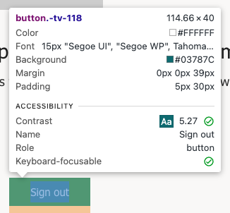
Below, we have an example of content that successfully passes the criteria, and the report illustrating this:


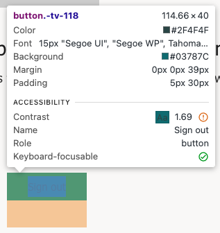
Next, an example of content that has failed to pass the criteria, and the report illustrating this:


In the second (failed) example, the text content may be difficult for some users to read.
Why Does It Matter?
Meeting this success criterion and ensuring your assets have sufficient contrast between content and background will help to ensure your audience can view that asset properly. In business terms, failing to address this issue could negatively impact the user experience and therefore business success.
“People with low vision often have difficulty reading text that does not contrast with its background. This can be exacerbated if the person has a color vision deficiency that lowers the contrast even further. Providing a minimum luminance contrast ratio between the text and its background can make the text more readable even if the person does not see the full range of colors. It also works for the rare individuals who see no color.” – WCAG 2.0 guidelines
How Do I Fix It?
Fortunately, this is an easy issue to address.
Ensure text elements have sufficient color contrast against their background. Avoid problematic color combinations and distinguishing elements by using only one color.
You may also consider implementing a control function to allow switching to a “high contrast mode” built specifically to support those who need greater contrast to assist them in viewing or reading.
Why is this important?
It’s estimated that 16% of the world’s population – 1 in 6 of us – have a significant disability. In a world where technology continues to play a critical role in our daily lives, our work, our learning, and many of the businesses and services we need, it’s vital to ensure that everyone’s needs are catered for wherever possible. For any individual business, these statistics and the importance of what they represent cannot be overstated.
Thursday, 16th May 2024, marks Global Accessibility Awareness Day, an annual event for institutions and technology companies to draw attention to the vital goal of ensuring digital assets—from websites to photos, video, audio, and social media—are accessible to everyone, including people with disabilities that may impair their sight, hearing, or mobility.
As a specialist in application modernization and development, gravity9 is committed to this inclusivity. Here, we’re looking at some key findings of the annual WebAIM (Web Accessibility in Mind) report, which studies 1,000,000 home pages to assess their accessibility and highlight any shortfalls. We’ll be examining why they matter and what you can do to ensure that you’re not letting your customers or your business down by failing to address these vital areas.
More in This Series
Here’s the full set of articles in this series: Common Accessibility Failures and How to Avoid Them.
- Low Contrast Text
- Missing Alt Text
- Missing Form Labels
- Empty Links
- Empty Buttons
- Missing Document Language

